Indian Express
The Home Edit: How to make colours work for your home
The Home Edit is a weekly series curated by Shiny Varghese that invites architects and designers to share their hands-on expertise on ideas for your home. Whether you are building, renovating, or simply refreshing a space, the series provides actionable advice and inspiration to help you make better choices for where you live. In the first part of this series, Shabnam Gupta, an interior designer-entrepreneur, shares her thoughts on colours in your home.
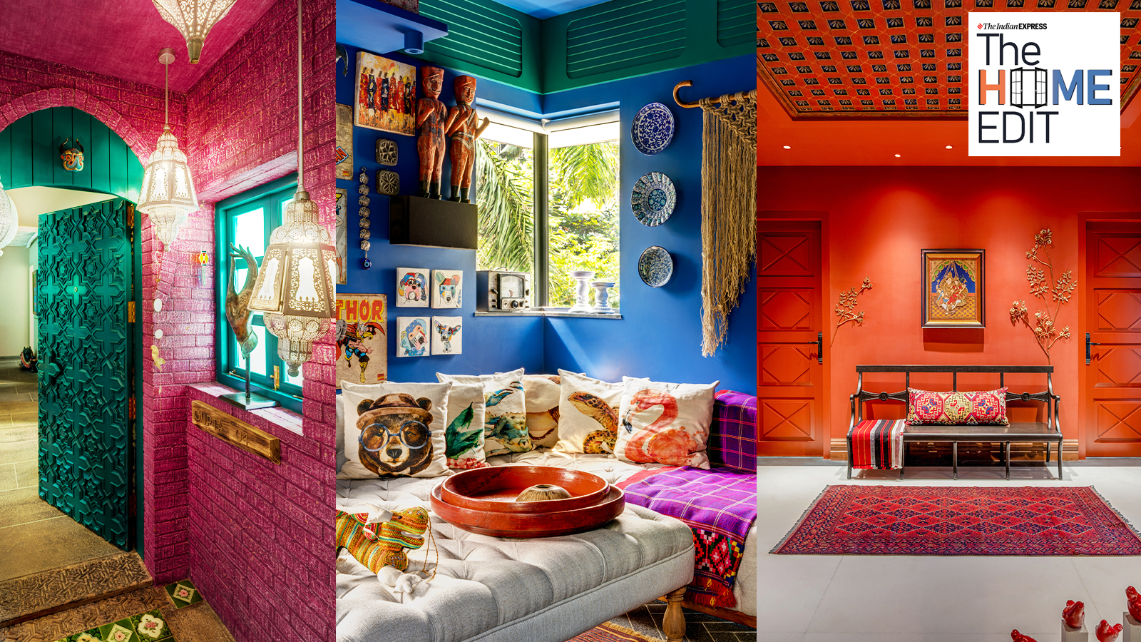
Colour drives how a space feels before you notice the furniture or layout. It can expand a room, add intimacy, highlight architecture, or completely change the mood. The difference between a space that feels intentional versus chaotic comes down to how colour is handled.
Dos: Ideas to make the most of colour in interiors
Start with Mood and Light, Not Just a Swatch
Every colour shifts with natural light, so the same terracotta can look earthy at noon and muddy at night. Before picking a shade, decide what the room should feel like. Want energy for a lounge? Go saturated. Want calm for a bedroom? Choose muted, desaturated tones. Paint large A3 samples on multiple walls and live with them for 48 hours. Watch how morning sun, evening lamps, and cloudy daylight change them. The right colour supports the room’s purpose and works with your light, not against it.
Before picking a shade, decide what the room should feel like. (Courtesy: The Orange Lane)
Use the 60-30-10 Rule to Create Balance
This ratio keeps bold choices from being overwhelming. Your 60 per cent is the dominant colour — usually walls or large surfaces. The 30 per cent is secondary, with upholstery, curtains or cabinetry. The final 10 per cent is your accent — cushions, art, or
decor that adds punch. For example, dusty rose walls 60 per cent, navy bed and drapes 30 per cent, brass lighting and patterned rug 10 per cent. This structure gives the eye places to rest while still letting colour lead.
Your 60 per cent is the dominant colour — usually walls or large surfaces (Courtesy: The Orange Lane)
Layer Texture and Finish Within a Palette
Flat colour on every surface feels lifeless. Depth comes from mixing sheens and materials in the same colour family. Think matte plaster walls, woven jute, velvet cushions and glazed ceramics all in tones of blue. The variation catches light differently and adds richness without adding new colours. Even a single-colour room feels complex when textures do the work.
Use Colour to Highlight Architecture and Define Zones
Colour isn’t just for walls. Painting a ceiling, archway or built-in joinery draws attention to details worth celebrating. In open plans, a single feature wall or painted nook can visually separate living from dining without walls. This is especially powerful in
apartments where every square foot counts. Let colour do the zoning so your floor plan stays flexible.
Bridge Bold Colours With Natural Materials
High-saturation colours feel grounded when paired with wood, stone, linen, cane, or unlacquered brass. These materials add organic texture and soften the transition between strong hues. A maroon wall feels sophisticated against grey stone and oak, not aggressive. If you love bold paint, let timber floors, raw silk curtains, or a stone countertop be the mediator. It keeps the palette warm and human.
Story continues below this ad
If you love bold paint, let timber floors, raw silk curtains, or a stone countertop be the mediator. (Courtesy: The Orange Lane)
Don’ts: Common Colour Mistakes to Avoid
Copy a Palette Without Considering Context
A colour that looks stunning in a large, sun-filled space can feel oppressive in a small, north-facing room. Light, ceiling height, and existing finishes all change how a hue reads. Don’t lift a palette from Pinterest and expect the same result. Instead, adapt the idea of it. If you love a bold magenta corridor, but your hallway has no windows, use that colour on the inside of a door or in art instead of the four walls.
Ignore the Ceiling and Undertones
Leaving the ceiling white by default is a missed opportunity — it’s the fifth wall and can make a room feel taller, cosier, or more finished. Equally important: undertones. Pairing a cool blue-grey wall with warm yellow downlights creates a subtle clash that makes the space feel “off.” Always check your whites, greys, and neutrals against each other in daylight. If undertones fight, the whole scheme will feel unresolved.
Use Multiple Bold Colours at Equal Strength
When red, teal, yellow, and royal blue all compete at 100 per cent saturation, the eye doesn’t know where to land. Maximalism works only when there’s clear hierarchy. Pick one hero colour, then support it with tones that are muted, darker, or lighter versions of it. If you want multiple bolds, keep them in separate zones or use large neutral breaks — white trim, wood floors, or stone — to give visual relief.
Pick Colours Under Store Lighting
Fluorescent showroom lights are nothing like your home. They wash out warmth and skew cool tones. Always test paint at home, on-site. Brush out two coats on large boards and move them around the room. Check them during the day, at dusk, and under your actual lamps. What looks perfect at the store often feels completely wrong in situ. This one step prevents 90 per cent of repaint regrets.
Story continues below this ad
Let Drama Override Function
Dark, moody colours can be beautiful, but a charcoal bedroom with no task lighting will be frustrating daily. Similarly, a high-gloss red dining room might look amazing but cause glare during meals. Always ask: how will this room be used? Reserve the highest drama for transitional spaces, powder rooms, or media rooms where you spend less time. For bedrooms, studies, and kitchens, balance impact with livability. Good colour serves the people in the space first.
Colour works when it has purpose. Start with how you want to live, test thoroughly, and let materials and light guide you. Get those right and even the boldest palette will feel timeless.
Shabnam Gupta is an interior designer-entrepreneur and founder of the retail brand Peacock Life and one of India’s most respected design studios the orange lane. Over a career spanning more than two decades, Gupta has designed award-winning homes, hospitality destinations and luxury commercial environments
View original source — Indian Express ↗
Related stories

Wired
TechnologyJun 16, 2026 · 1 min
Need a New Lamp? Here Are 7 Bright Ideas
Wired

Indian Express
EntertainmentJun 6, 2026 · 1 min
Inside Krushna Abhishek’s Mumbai home: Brick walls, all-black kitchen, expansive wardrobe
Indian Express
Indian Express
EntertainmentJun 5, 2026 · 1 min
‘Sanjay Leela Bhansali ka pura bathroom….’: Inside Terence Lewis’ artistic Mumbai home
Indian Express

The Verge
TechnologyJun 9, 2026 · 1 min
Hue’s SpatialAware finally made me appreciate color-changing lights
The Verge